MOO Guide Customisation
MOO is an online print and design company that is passionate about delivering great design right at its customers’ doorsteps.
Their problem was that their help desk was outdated and needed a more modern customer experience for their clients.
The initial version was 6 years old and was one of my first ever Help Center customisations done. Yes, the initial version was done by my team and myself as well.
The initial design looked like this:
MOO Help Center design from 2014
In 2019 MOO came back with a very sleek modern look.
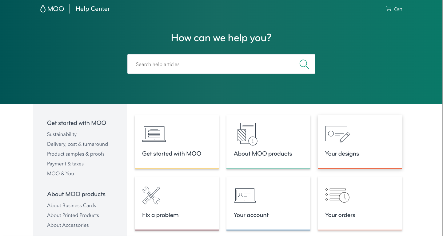
Homepage
MOO Guide homepage from 2019
The design is clean and user friendly.
Header
Logo takes user to the MOO main website
“Help Center” takes user to the homepage of the Zendesk Guide Help Center. This is common practice so that the user experience would remain the same as per the main website where the user is normally used to navigating to the “home“ when pressing the logo
Cart is an external URL that takes the user to the cart page on the main website
Search in Zendesk which has all the Knowledge Base content indexed
Icon navigation for categories so that the use would have an easy visual way of browsing
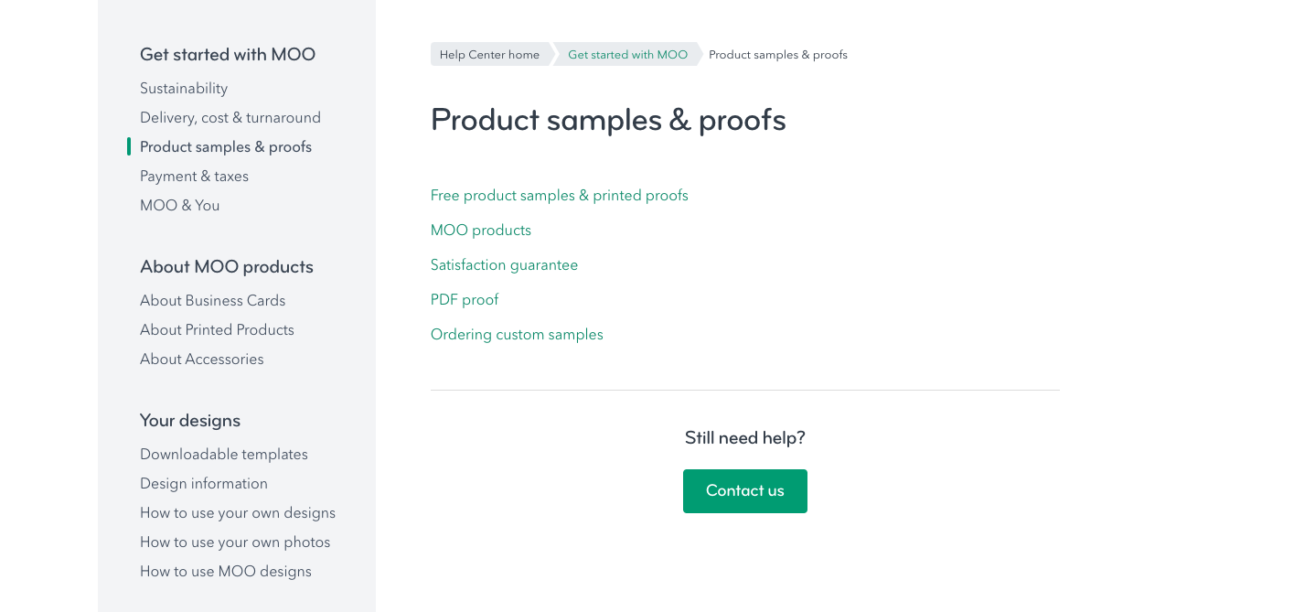
Left Menu
In the example above we are in category Get started with MOO —> section Product samples & proofs
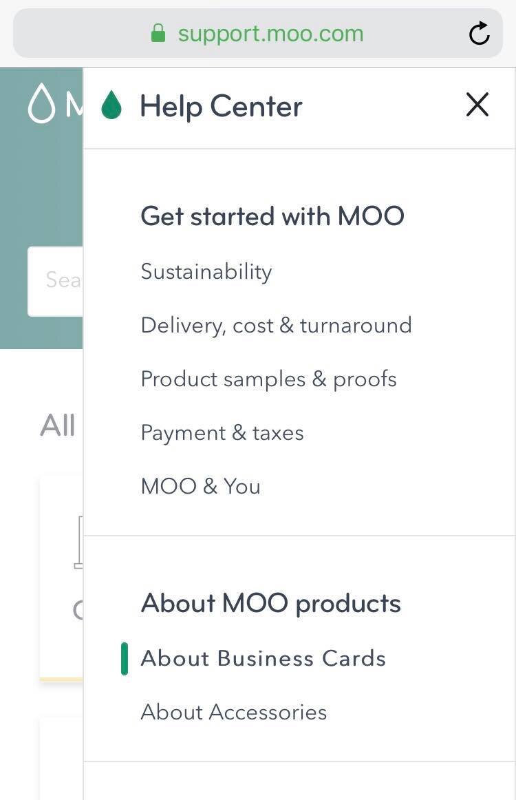
Left hand menu for category and section navigation - we made the categories dynamically load from the Zendesk Guide API so the user would have an easy way of browsing content. If an update is made to the category(or section) naming occurs, or a new category(section) is added, the change would automatically reflect in the front end.
Please notice that for ease of navigation, we included breadcrumb navigation as well. Pretty cool and no way to get lost.
Popular Articles
“76% of users prefer to help themselves rather than interacting with a human. ”
The popular articles are there so users can have a quick easy way of reading the articles which are the most viewed in the Help Center and what most users are looking for. After all, 90% of all incoming cases are the same so if there is a good documentation of users common problems, users can help themselves.
The articles are the most common issues in the Help desk “Top articles“ and then by category: Design, Error messages, Shipping. We have this really cool way of adding a label of the articles “design“ for Design, “shipping“ for Shipping etc.
The article has to be promoted and give the adequate label for the category it wants to represent in the homepage. Our script would know to look for promoted articles and according to the label it had, it would be automatically populated in the homepage in its respected category. Pretty neat!
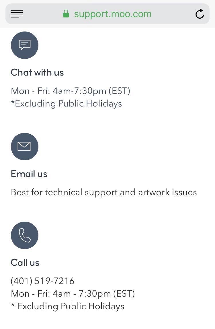
Contact us
We don’t reveal all what we offer in terms of Contact to begin with.
But after user clicks, boom:
Also, some useful tips on how and when to get in touch
Choose your language
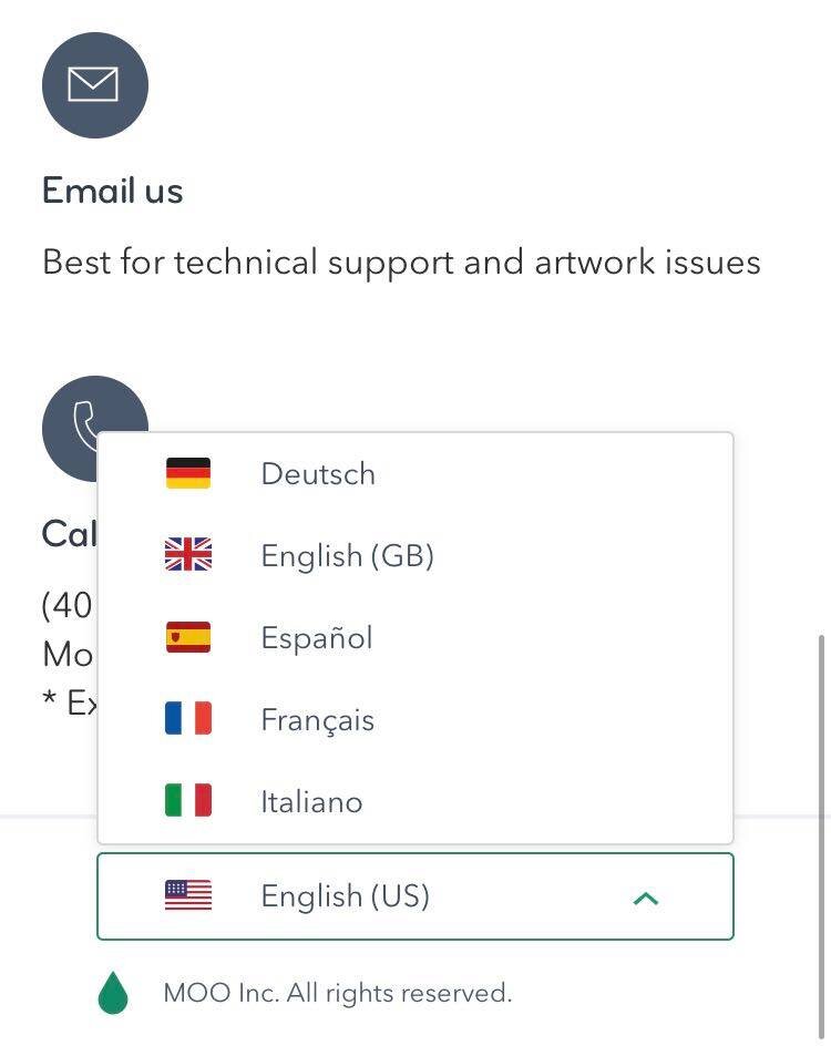
Choosing the language user needs support in is also very important. We used dynamic content to populate the elements which are not automatically translated by Zendesk (e.g Search, and the language names, Sign in etc) and also the Categories/Sections and Articles which if translated automatically appear. By this I mean “Chat with us“ “Email us”, “Popular articles” etc
Article page
For ease of navigation, we added a “Previous/Next Article” for the articles in the Section that you’re in.
Related articles which is a Zendesk built in feature to further help users browse the Knowledge Base.
Contact us
Dropdown to choose the type of request the user is having. All done to better categorise and route the incoming request to the appropriate team to deal with them.
Search results
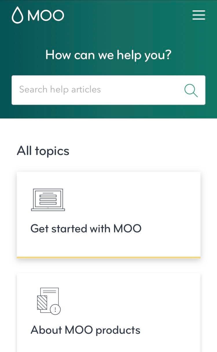
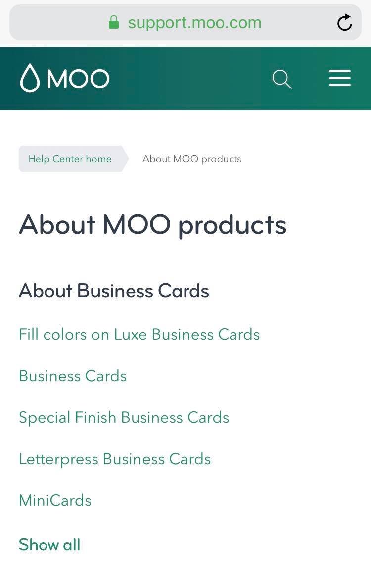
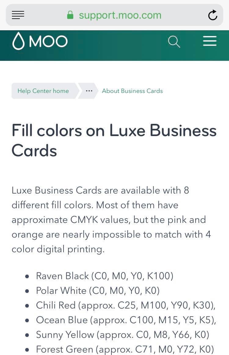
Mobile experience
See it in action here: https://support.moo.com/hc/en-gb
I really enjoyed working on this project and I am grateful to having contributed to a cool Guide experience.
But it’s not just about how I felt about working on this, it’s also about how the experience was from the other side. Below is the testimonial coming from Doreen Berard - Director, Global Customer Service.
“MOO has worked with Dominic over the past few years. In each instance, he was professional and responsive. Any changes or updates that needed to happen he would clarify to ensure he understood our needs and would set reasonable expectations. It was reassuring to partner with Dominic. ”
